Dashboard
Dashboard Layout
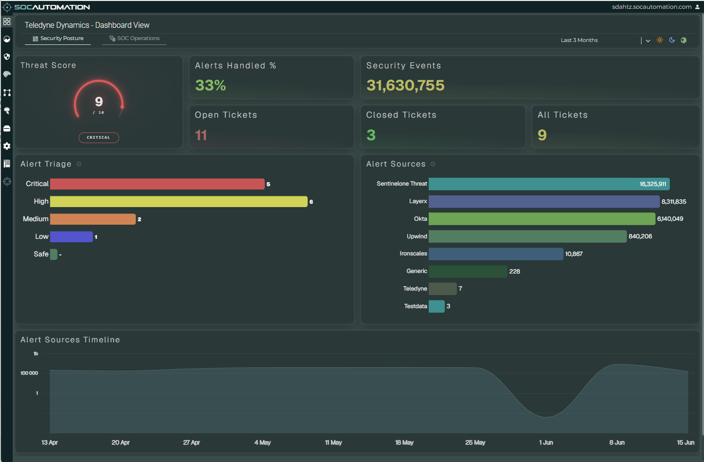
The Dashboard presents a consolidated view of the organisation's current security posture. It brings together risk indicators, alert-processing metrics, ticket status, source volumes and event trends in a single operational view.
Dashboard Header and Controls
The dashboard header identifies the selected organisation and confirms that the user is viewing the Dashboard. The controls immediately below the title determine which operational view and reporting period are displayed.
Security Posture
Displays the organisation's security position using the threat score, alert-handling statistics, ticket status and security-event analysis.
SOC Operations
Provides access to the operational dashboard view. Its available content depends on the SOCAutomation configuration and enabled capabilities.
Reporting Period
The time-range selector controls the period represented by the dashboard metrics and visualisations. In the example shown, the period is set to Last 3 Months.
Display Controls
The controls on the right of the header provide the available dashboard display and theme options for the current user interface.
Security Summary
The summary panels provide an immediate assessment of security activity within the selected reporting period.
Threat Score
Provides a prominent risk indicator for the organisation. The numeric score, colour and status label allow analysts to recognise the current threat level without first reviewing individual alerts or incidents.
Alerts Handled %
Shows the proportion of alerts handled during the selected period, providing a high-level indication of alert-processing activity and operational coverage.
Security Events
Shows the total volume of security events represented in the dashboard for the selected reporting period.
Open, Closed and All Tickets
Summarises ticket activity and provides immediate visibility of the active workload, completed work and overall ticket volume represented by the current view.
Alert Triage
The Alert Triage chart groups alerts by severity. Critical, High, Medium, Low and Safe categories are presented as colour-coded horizontal bars so analysts can quickly identify where investigation effort is concentrated.
The value displayed at the end of each bar is the number of alerts in that severity category for the active reporting period.
Alert Sources
The Alert Sources chart shows the volume of security events associated with each source. This makes it possible to identify the technologies and data feeds contributing the greatest amount of activity to the platform.
Source names and totals are ordered visually to make high-volume contributors easy to distinguish from lower-volume or test sources.
Alert Sources Timeline
The timeline displays security-event volume across the selected period. It provides a visual indication of changes in activity, including sustained volume, sharp increases, reductions and other patterns that may warrant further investigation.
Use the timeline together with the source and triage panels to distinguish a general change in event volume from activity concentrated in a particular source or severity.