DataHelix Dashboard
DataHelix Dashboard
The DataHelix Dashboard provides a concise analytical summary of recent activity inside the DataHelix AI application. It helps analysts understand how much has been processed, where activity is concentrated and which patterns warrant further review.
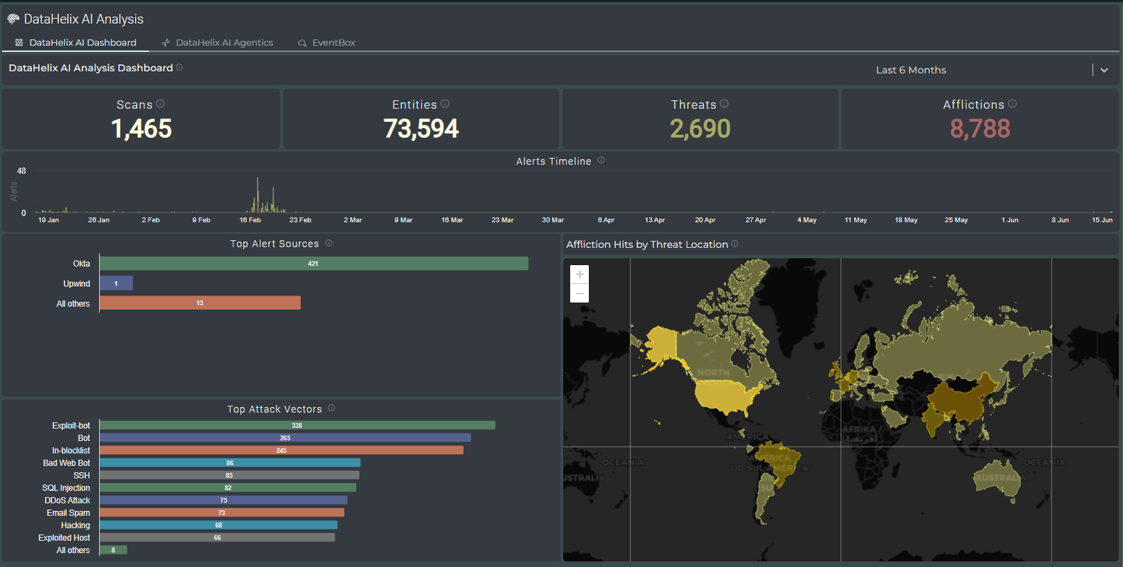
Dashboard Layout
The dashboard is arranged to give immediate visibility of analytical volume and concentration. Headline tiles across the top summarise the number of scans, entities, threats and afflictions, while the panels below provide trend, source and location-based context.
Headline metrics
The top-level counters summarise the overall scale of activity during the selected time range and give a quick indication of analytical workload.
Alerts timeline
The timeline highlights when notable activity occurred and helps analysts recognise clusters, spikes or quieter periods across the reporting window.
Top alert sources
This chart shows which data sources are contributing most significantly to the current body of analysis, making it easier to identify dominant signal sources.
Affliction location map
The world map provides geographic context for observed afflictions, helping analysts identify regional concentrations and potentially relevant distribution patterns.
Using the Dashboard
The dashboard is best used as an orienting view before deeper investigation. Analysts can use it to establish the current scale and character of activity, understand the most active sources and identify attack vectors or locations that justify additional research within the AI assistant or EventBox.
Operational overview
Use the dashboard at the start of a review period to build a quick picture of the recent analytical landscape.
Trend awareness
Use the timeline and comparative charts to understand whether activity is stable, concentrated or changing.
Pivot points
Treat the most prominent sources, attack vectors and regional patterns as pivots for further exploration in the rest of the application.
Context for deeper analysis
The dashboard complements the more detailed entity and evidence views available in the AI Assistant and EventBox.
Video walkthrough placeholder
Add an embedded walkthrough for this section by inserting an <iframe> or <video> element and applying the is-visible class to this container.